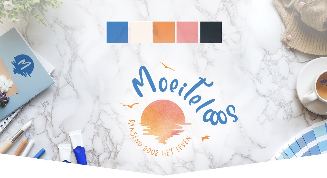
Going steady with your brand.
Why brand consistency is essential for the success of your business.
Whether you have just started your business or have been running it for many years, it needs to be clear and consistent. You want people to know what your brand stands for, what it represents, and you want them to know within the first minute they look at it. This may seem like an impossible task, but luckily, it is not. With some quick and easy rules you will turn your brand from nothing to Nike in no time.
Your ideal customer
When creating anything for your brand it’s important to keep in mind who you’re creating it for. Who are your customers? What do they expect from you? What do they want out of life and what do they want to see from your brand? These questions will help you design all of your content in a consistent manner. Whatever your brand may be, and if you have 20 or 20.000 followers, you must
never lose focus of the fact that you are speaking to people, and possible customers.
Brand logo
Your logo is one of the first things that comes to mind when talking about brand consistency. This is a key element in your branding and should be kept consistent. It is not necessary, and even confusing, to change your logo or your logo’s colours depending on where you use it. Whether it is
on Instagram, Facebook, or a flyer, your logo should not change. If you are constantly switching things up, your brand will become chaotic and will leave customers confused. No matter how good your product is, a confused customer is a customer that will soon start looking elsewhere.
Brand typography
Typography is one of the hardest parts to be consistent in, because there are so many options to choose from. Readability is one of the most important aspects of choosing a font for your website or other branding. If people can’t read your message, they will find another brand that is more user friendly. To make it easier for yourself, you can pick fonts out of different categories to match together. By picking a serif, a non-serif and a script letter you can mix and match as you please.
Brand colours
When we think of famous brands, their colours often make us recognize the brand in the first seconds. If Coca Cola all of a sudden use blue instead of red, people would be confused and wonder why. Being consistent with your colours enhances your credibility and recognizability. While
it may seem nice to switch it up every now and then, it will confuse your customers and maybe even scare them away.
All of these things are important when it comes to consistency. Brand logo, typography and colours can turn your brand into a big success when they are used the right way. With these tips your brand can become both timeless and unique.
How we help your brand
While brand consistency is important, it can be hard to keep track of all the things you need to do. If all of these steps make you feel overwhelmed there is a very easy solution: hire an agency! By doing this you can focus on the aspects of your brand you love without having to take care of all the rest. As a digital agency we offer multiple packages to take some work off your plate. One of our options is a specific branding package. If included in your package, you’ll receive a Brand Book PDF with examples on how to use your new branding. This is an important document to refer back to at any time when creating new visuals and communications for your brand and show to new people who get involved in your business to know how things need to look. It is important to keep a professional and consistent look throughout your communications. It will make you appear more professional, trustworthy and recognizable for your customers. A brand book or brand guidelines book can at all times be purchased separately as well.
Whether you decide to try your luck managing your own branding or decide to get the help of an agency, remember to keep it consistent!


